Layer
From the drawing board to paying users.
Introduction
Layer is a Berlin based company founded by ex-CFOs in different companies, aiming to solve their own pain points of data collection for FP&A purposes.

Hypothesis
CFOs at scaling SMBs suffer from google sheets limitations when it comes to their data collection processes, they are forced to either switch over to expensive and hard-to-implement FP&A solutions or continue using vanilla google sheets with a substantial amount of manual work.
Goal
Validate the hypothesis, discover pain points, form concrete problem statements, and build the MVP.
User
Interviews
To initiate the discovery process, we identified a series of profiles that we would like to interview, in order to find out about their pain points.
These profiles were curated based on their domain involvement and availability.
CFO at a SaaS SMB
Head Of Marketing at a SaaS SMB
Head Of FP&A at an SMB
Finance Manager at a VC
Portfolio Manager at a VC
Questions
Enables users to review incoming changes, and accept or reject them, providing clarity and reducing cognitive load and manual effort.
Pain Points
Based on the conducted interviews, we have consolidated a conclusive list of pain points that we can convert into user needs.
Although I can't share the full list of pain points publicly (because NDA 👀), these were the most frustrating pain points, presented with a relative frustration level to help us prioritise our MVP.
Pain Point
Frustration
It is not possible to selectively share parts of my spreadsheet because the only option available on Google Sheets is to share the entire spreadsheet. This presents a challenge as the spreadsheet contains sensitive information and it is a lot of tedious manual work to shield this data.
🤯🤯🤯🤯
Consolidating data into my spreadsheet requires a significant amount of manual effort and can become very challenging when multiple individuals are involved.
🤯🤯🤯🤯
Collaborators may submit inaccurate data to my spreadsheet or alter information that should not be changed, and I am unable to detect or prevent these occurrences.
🤯🤯🤯
User Needs
Again NDA 👀 so no detailed user needs list, but essentially what we did was convert the pain points into concrete user needs that can be prioritised for our MVP.
The following were the most pressing needs.
Need
Priority
Granular sharing: Give access to a part (sheets or ranges) of my spreadsheet
Top
Data sync: Easily consolidate data into my spreadsheet
Top
Gate keeping: Control what changes make it into the spreadsheet
High
Solution
After conducting various ideation sessions, and pinning down the user journey maps, I worked on wireframes to visualise our evaluate our solution ideas.
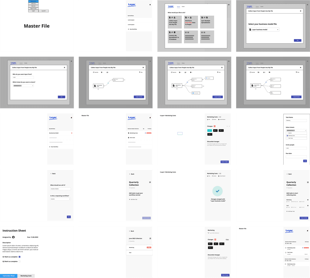
At this stage it became clear to us that what we want to build is a google sheets add-on.
There were 3 main pillars for our solution:
Connections
Enables users to share granular areas of their spreadsheet with ease, while automatically syncing the shared areas.


Gate Keeping
Enables users to review incoming changes, and accept or reject them, providing clarity and reducing cognitive load and manual effort.

Overview
Enables users to easily know where their attention is needed by providing a conclusive overview of their connections.

Other Screens

Data &
Learnings
Throughout our journey from early MVP to paying users, we conducted various tests and interviews, but data was the centre piece of our research.
Problem:
One of the interesting data points was the drop-off rate on the connection creation journey crossing 43%.
This was significant due to connection creation journey being one of the core ingredients of the product.

Solution:
To solve this we relied on a combination of user interviews and Smartlook recordings.
Our findings were that some distracting MVP UI was mostly to blame for the significant drop-off rate, along with lack of onboarding.
Remove distracting UI (highlighted in red)

Add various onboarding elements like rich tooltips and explanatory empty states.

Results:
The adjustments significantly increased completion rate and reduced user distraction, and that was clearly reflected in the data.

Problem:
Only 35% of users completed the signup flow, a significant drop-off.
Solution:
The main conversion killer here was friction caused by the complexity of the signup form, so our approach was to significantly lower friction of this step by reducing the form into just an email field.

Result:
The adjustments resulted in a 38% increase in the conversion rate, from 35% into 73%.